Website Redesign for a Composer
A website redesign created to express a composer’s unique style, expertise, and body of work through a more distinctive visual experience.
OverviewAs the lead web designer, I redesigned a composer’s website to better showcase his expertise, creative style, and body of work. The new direction moves beyond a traditional portfolio, using cinematic imagery, thoughtful layouts, and editorial-inspired design to create a website that feels distinctly his own.
Lead Designer
Figma, Illustrator
IndustryCompanyToolsRoleDeclarative
Music
The ProblemThe existing website didn’t tell a compelling story about the composer or showcase his work in a way that reflected his creative identity and future direction.
The Before
Home
Credits
Press
About
Assessing the Existing Site
The existing website had strong content and credibility, but it didn’t fully communicate the composer’s creative style or breadth of work. It felt simple and portfolio-driven, with limited visual storytelling and opportunities to better organize and present projects and credits. The redesign created an opportunity to build a more distinctive visual identity that reflected his expertise, personality, and focus on live-action work.
Branding
After multiple rounds of logo exploration, the final logo and branding needed to reflect his inspirations, including jazz, while capturing his bold, distinctive style without feeling overly feminine compared to his previous style.
Wireframes
I began exploring the website design through wireframes. As the lead web designer, I translated these early explorations into increasingly refined prototypes to establish the structure, interaction, and visual rhythm of the site.
Initial Prototype Feedback
The client felt the initial prototype stayed too close to the original and didn’t capture the editorial feel he wanted, so I took a step back, took a more creative approach, and created several iterations that ultimately led to a stronger, more editorial design.
First Prototype: Credits Page
Exploring Multiple Layouts
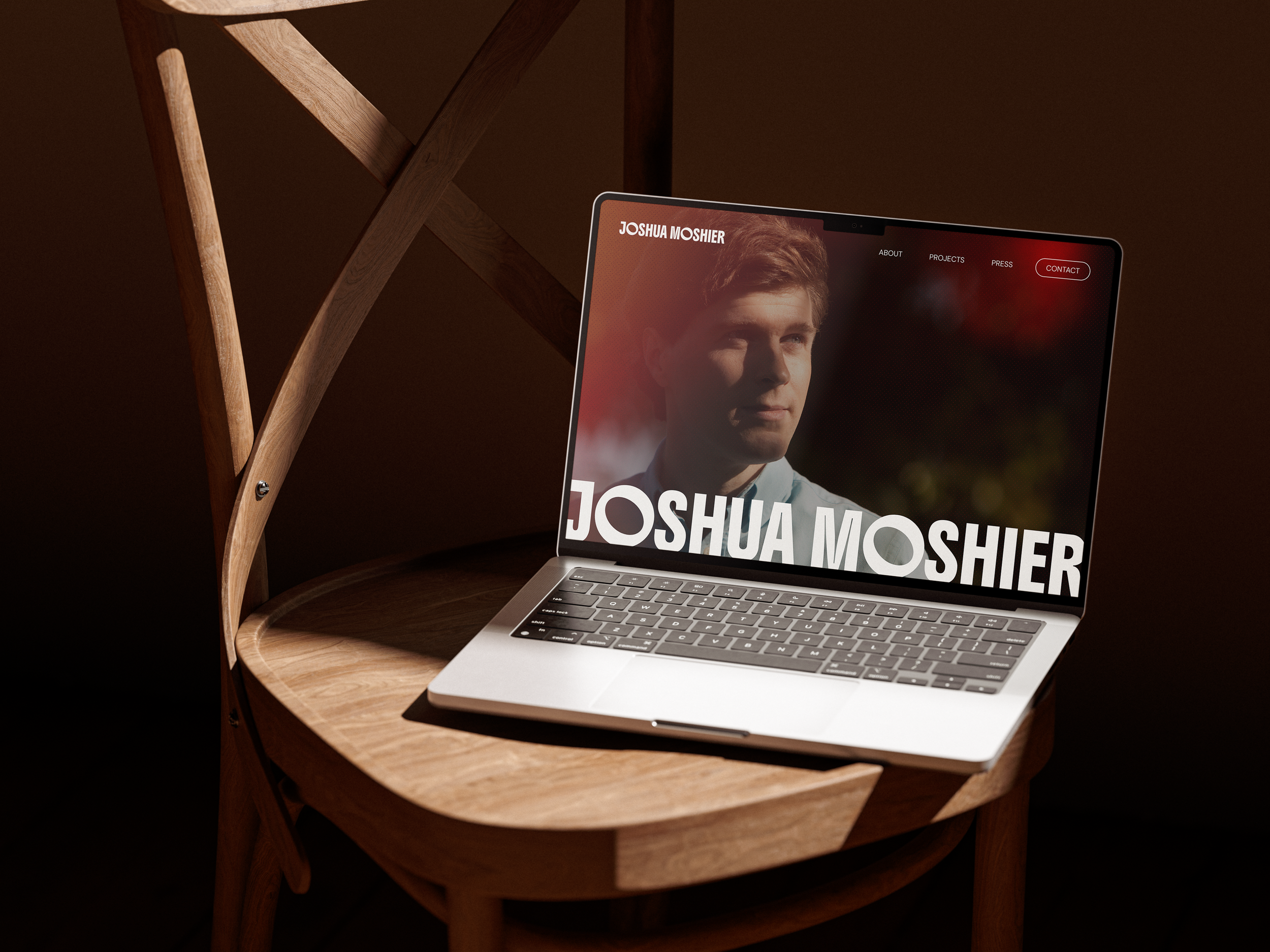
Final Solution
Before
After
Solution
In this version, each project showcases a scene from its respective show, creating visual variety and intrigue. The staggered layout adds movement while guiding viewers through the projects in a deliberate order.
Before
After
Accessibility
I created a chart based on the Web Content Accessibility Guidelines (WCAG) that highlights which colors from the brand’s color palette work well together for optimal readability and which do not. This will make it easier for the client to expand the website if needed.
More Case Studies
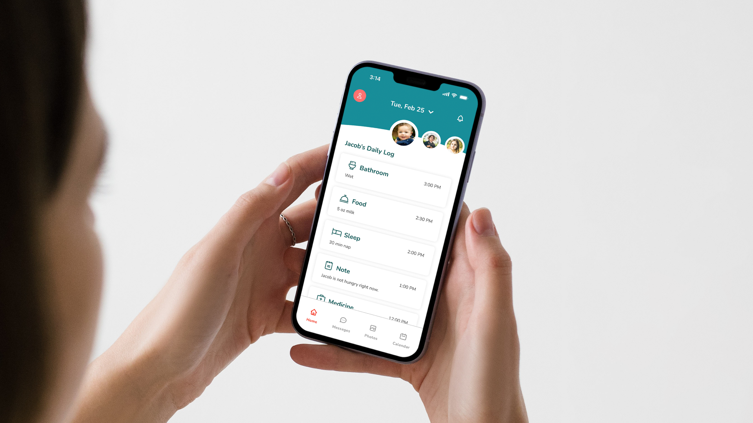
Improving Communication Between Parents and Caregivers
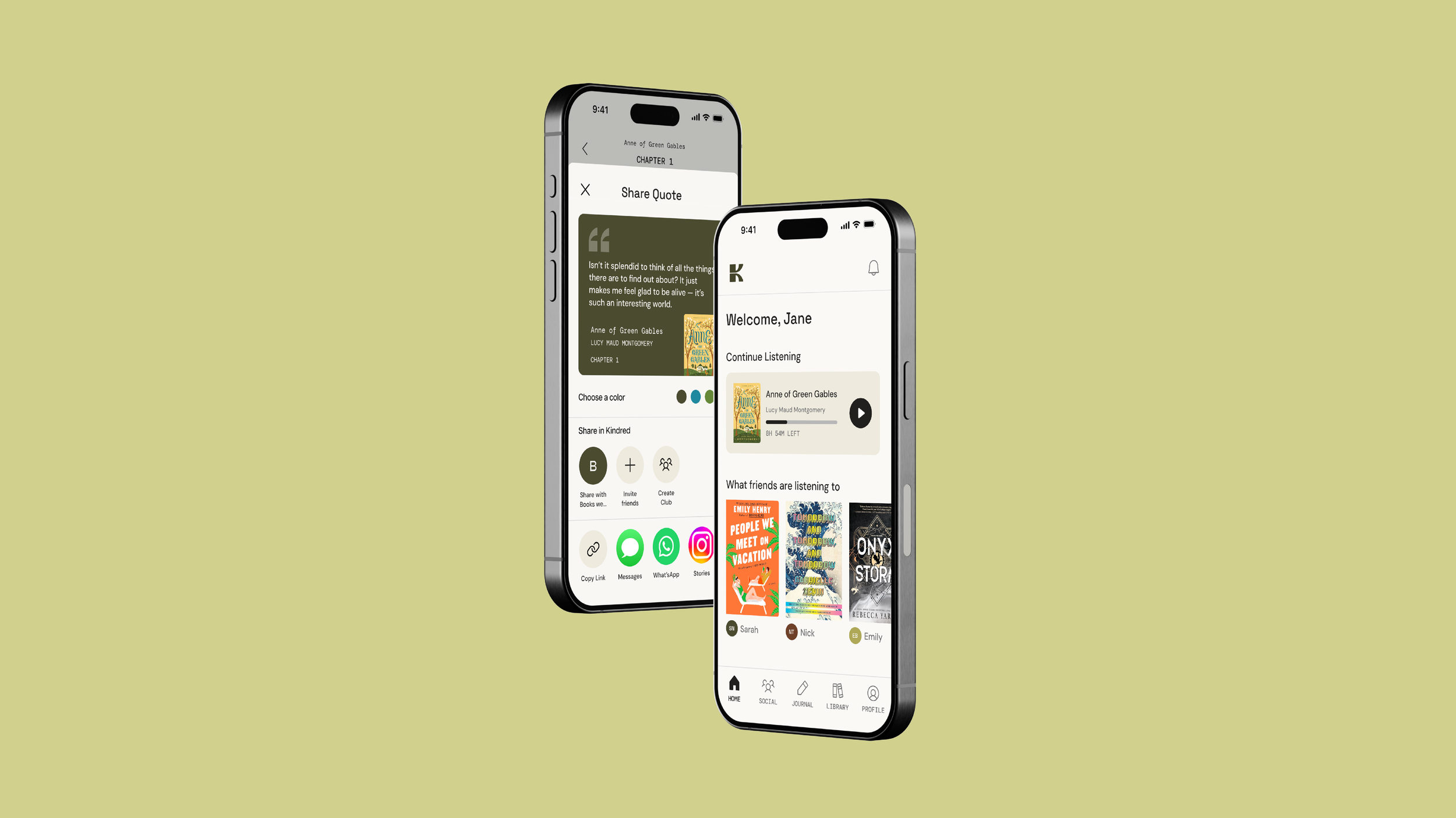
Designing a Social Audiobook Experience
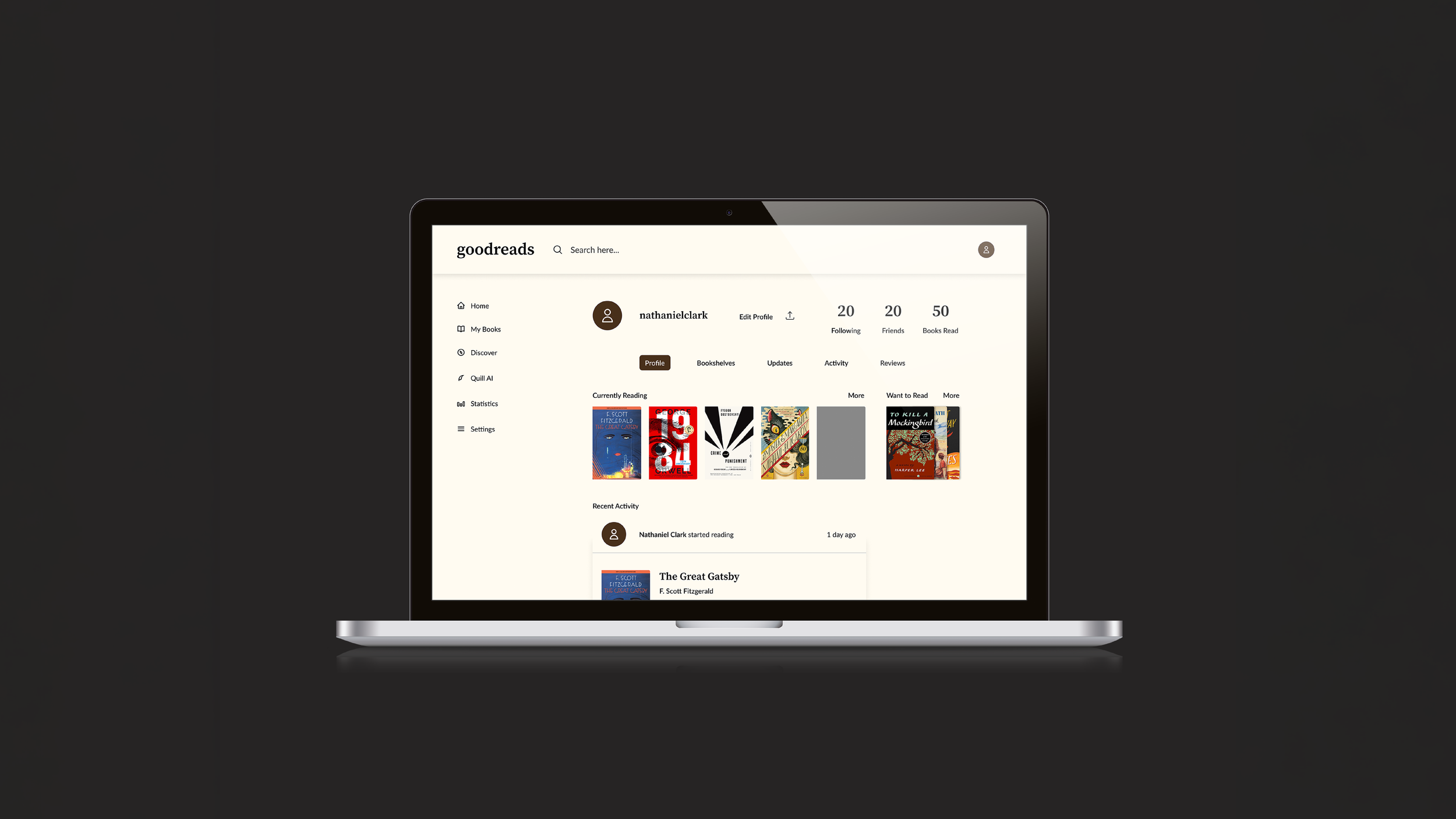
Design Capstone ProjectRedesigning the Goodreads Experience
Mobile UX DesignWeb UX REDesign