Goodreads Redesign
Redesigning Goodreads to create a cleaner, more visually engaging interface with simplified book organization and intuitive navigation.
Overview
I use Goodreads to track books and share what I’m reading with friends, but I noticed the web experience feels outdated and difficult to navigate. This inspired me to redesign Goodreads to simplify organization, improve navigation, and make tracking reading progress more enjoyable. The goal was to create a cleaner, more intuitive experience that helps users focus on reading and connecting with others.
Role
Tools
User Research, Prototyping
Figma, Adobe Illustrator
Details
Timeline
Academic Project
4 Weeks, Spring 2025
The Problem
At this point, Goodreads hadn’t had a redesign since it launched in 2007. The user experience feels outdated, confusing, and hard to navigate. A cleaner, more intuitive design is needed to help users focus on what they came to do: enjoy reading and connect with others.
Current Goodreads Interface (The "Before")
The existing Goodreads interface features a cluttered layout, text-heavy organization, complex navigation, and outdated visual design that creates a less intuitive user experience.
User Research
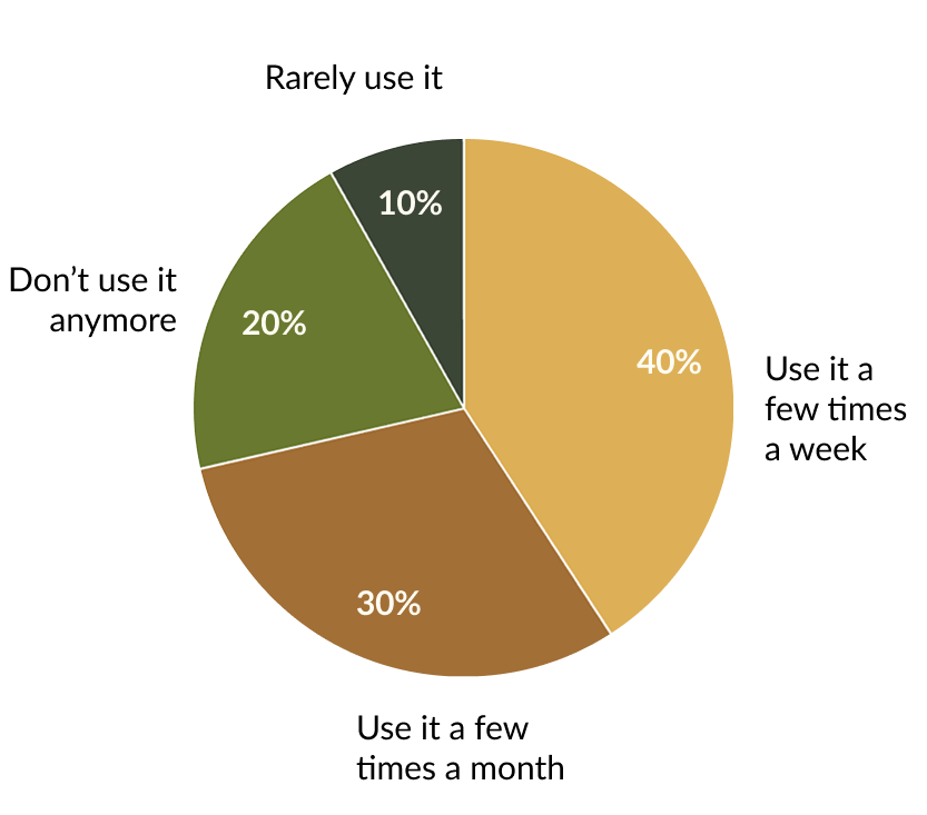
To better understand the needs of Goodreads users, I conducted a survey of both active and former users.
Former users helped identify key frustrations that caused them to leave, insights critical to improving the experience.
To guide the design direction, I conducted user research to understand which features readers value most and where the platform creates friction. The findings showed that book tracking is the primary use case (90%), followed by connecting with friends (70%) and reading reviews (60%). These insights shaped the redesign by prioritizing three core experiences: tracking, socializing, and reviewing, creating a more focused and intuitive user experience.
90%
Use Goodreads to track books
70%
Use Goodreads to connect with friends
60%
Use Goodreads to read book reviews
User Feedback
To better understand the emotional and functional friction readers experience, I gathered firsthand user feedback to pin down specific pain points within the platform. The qualitative data echoed a widespread frustration with the site's stagnant, outdated architecture, with users noting that the interface feels stuck in the past and inherently difficult to navigate. Beyond general aesthetic complaints, readers highlighted distinct functional limitations, such as a clunky profile layout and the frustratingly rigid process for managing shelf progress.
“It was built in 2009 and hasn’t been updated since. The user interface is so difficult.”
“Profile is kinda weird set up and it’s not easy to remove books off of currently read—maybe they should add a DNF category?”
Key pain points:
Outdated, cluttered interface that feels difficult to use
Confusing profile layout and navigation
Limited shelf customization, including no easy way to remove books from “Currently Reading”
Missing “Did Not Finish” (DNF) tracking category
Competitive Analysis
I analyzed both direct and indirect competitors to identify opportunities for Goodreads to improve its user experience, visual design, and book organization features.
Modernize design: Create a cleaner, more engaging visual experience.
Simplify organization: Make managing books and shelves more intuitive.
Improve navigation: Help users find, track, and explore books more easily.
Enhance personalization: Offer more flexible ways to organize collections.
Final Redesign Highlights
A cluttered, text-heavy layout with scattered navigation and small thumbnails that hide key reading activity.
Current Goodreads Profile Page
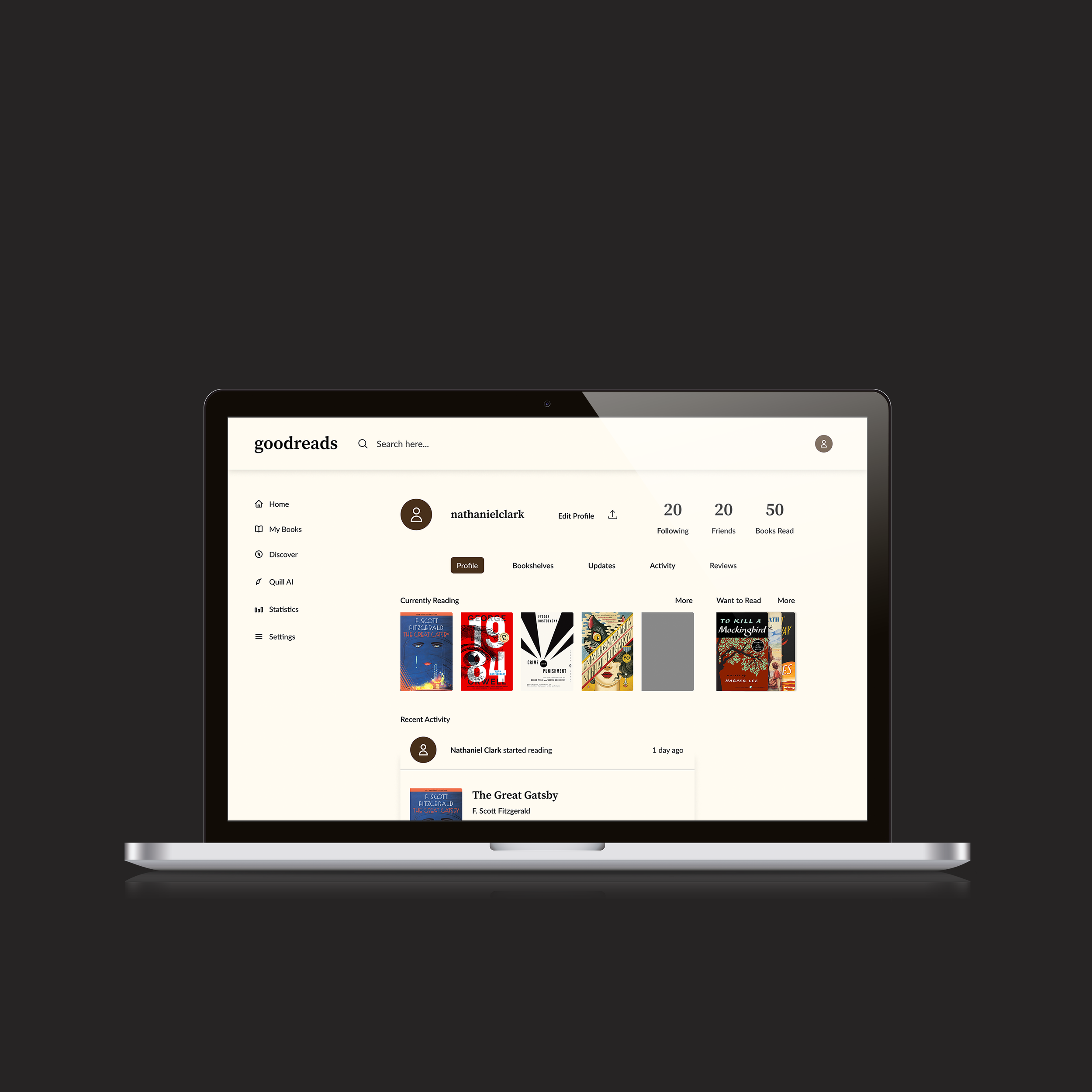
A clean, minimalist layout with simplified navigation, visual book covers, and clear social features that improve the reading experience.
Redesign Concept
Final Interactive Prototype
What I Learned
Listen to Users: Understanding their pain points can drive impactful change.
Balance is Key: Improving UX means respecting what users love about a platform while improving what holds it back.
Small Changes Matter: Simple updates like clearer buttons can improve usability.
Design for Edge Cases: Interfaces should be prepared to handle things like long titles, and large libraries.
Don’t Forget Error states: Designing helpful, clear error states builds user trust and reduces frustration.
Up Next