Designing a Fiber Arts Festival
A conceptual festival celebrating contemporary women fiber artists, inspired by the fiber art movement of the 1960s and 1970s.
OverviewThrough historical research, artist curation, and a comprehensive visual identity, the project explores how textiles challenged traditional boundaries between craft and fine art and continue to serve as a powerful medium for artistic expression.
TimeLineContext9 Weeks
Academic Project
ToolsRoleAdobe Illustrator, InDesign, Figma
Lead Designer
Research & Inspiration
Before developing the visual identity, I researched the history of the fiber art movement and its relationship to feminist art. I explored how artists used textiles to challenge established artistic conventions and reclaim materials traditionally associated with domestic craft.
This research informed the visual direction of the festival, connecting the movement's historical significance with the work of contemporary women artists. Rather than treating fiber art as simply a visual style, I approached the identity as a way to communicate its cultural history and continued relevance.
Developing the Identity
Using my research as a foundation, I developed a visual identity that united the festival's feminist roots with a contemporary perspective. The design needed to create a recognizable system that extended beyond the logo and communicated consistently across various formats.
Concept 1: Quilting
Concept 2: Thread
I curated three featured artists to highlight the festival's focus on contemporary fiber art and crafted a cohesive identity to bring the event to life. I explored two design directions: one centered on quilt shapes and the other based on a single thread. Ultimately, I combined both elements, as each brought valuable aspects to the overall design.
Refining the Direction
In this iteration, I combined the two concepts, but the visual hierarchy was off. As the deadline approached, I reassessed the design's visual hierarchy and realized that the initial direction was not effectively communicating the information. Instead of refining a system that wasn’t working, I pivoted and rebuilt the design.
This required rethinking the composition and prioritizing the relationship between the festival's identity, supporting information, and visual elements. Although this change came late in the process, it enabled me to create a more intentional direction that could be effectively carried through all the deliverables.
Final Solution
With the revised direction established, I applied the identity across a variety of promotional and branded materials. Each application offered a different opportunity to communicate the festival while maintaining a consistent visual language.
The deliverables included:
A primary logo and visual identity system
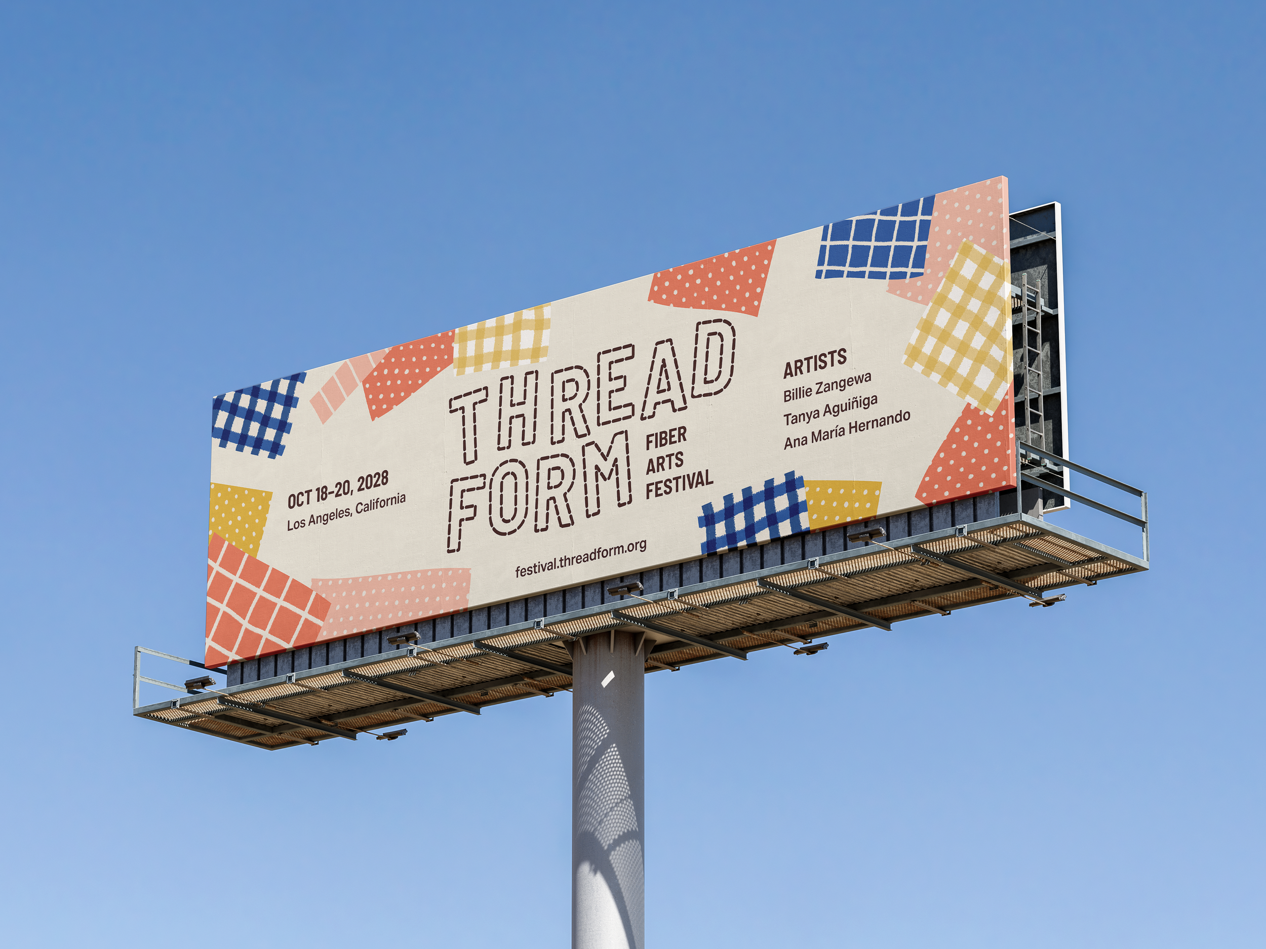
Promotional posters, signage, and large-format billboards
An animated logo motion graphic
Branded merchandise, including T-shirts, mugs, and buttons
Together, these applications demonstrated how the identity could function across print, motion, environmental placements, and physical merchandise.
Reflection
This project challenged me to balance historical research, conceptual development, and practical design requirements across a large body of work. It also reinforced the importance of evaluating visual hierarchy throughout the design process.
Revisiting the direction late in the project taught me that a strong design process isn't always linear. Sometimes, stepping back and reconsidering the work leads to a more cohesive and effective outcome.